Case Study:
The DePaul Art Museum
Project Overview
The DePaul Art Museum was looking to attract more visitors by engaging more pedestrians, commuters and art lovers from the local area. Through the #ArtAtTheL project multiple different prototypes were designed in order to aid in getting more of their potential user base to actively engage with their current and future exhibits.
#ArtAtTheL
Client
The DePaul Art Museum is a dynamic inclusive space for art. Ran by a very dedicated team of staff members, the DPAM aims to an inclusive platform for innovative artistic voices with a program that bridges local and global concerns.
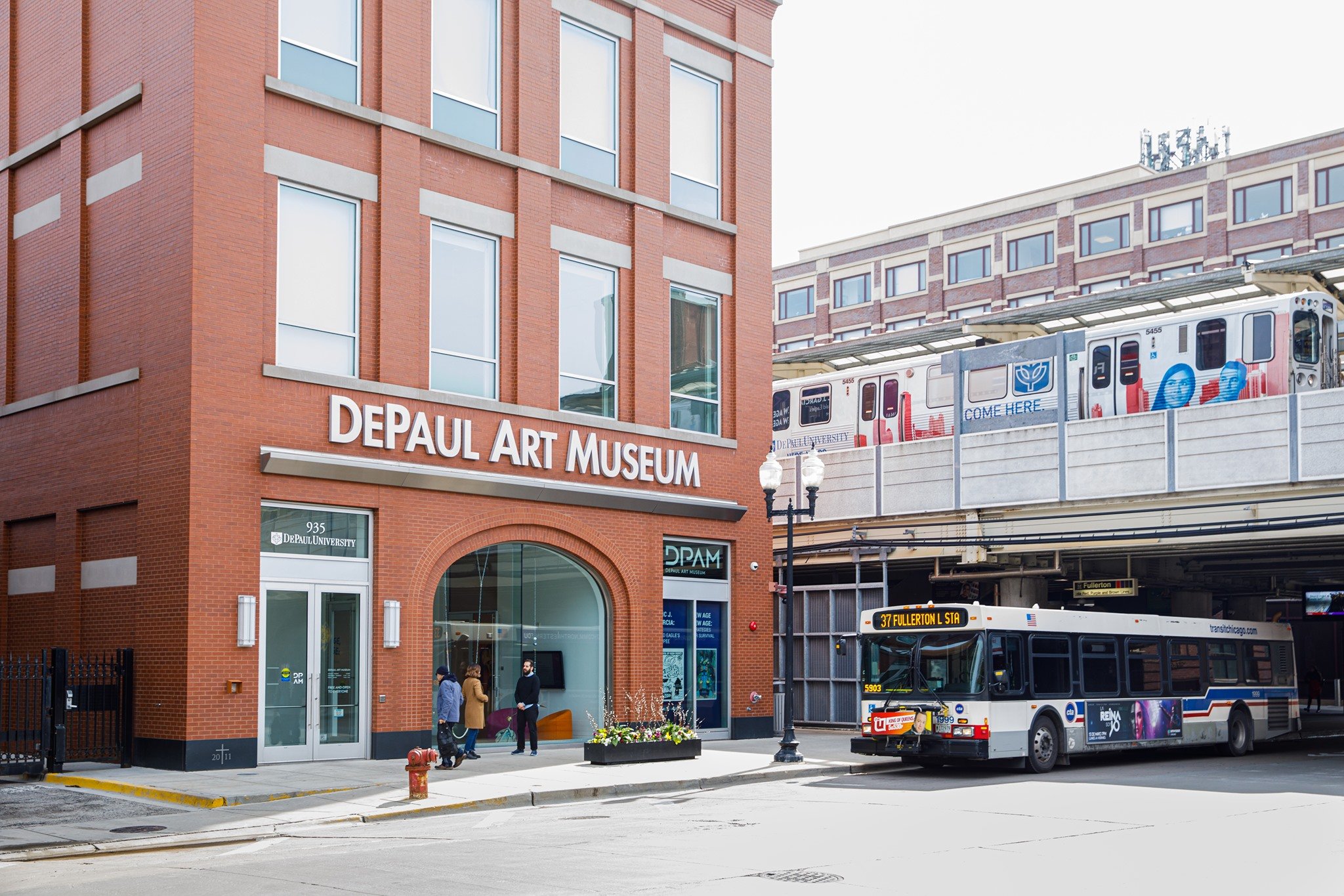
Located directly next to the Fullerton CTA stop in Lincoln Park, there is a great opportunity to increase foot traffic through various new and engaging designs
DePaul Art Museum - Staff
Laura-Caroline de Lara – Director
Ionit Behar – Associate Curator
David Maruzzella – Collection & Exhibition Manager
Audience
Chicago is a very diverse place with many different communities and people. We used LUMA’s stakeholder mapping method to determine our four primary groups of stakeholders.
CTA Commuters
DePaul Student
Art Lovers
Local Community Members
Problem Statement
DePaul Art Museum (DPAM)’s purpose is to connect people through art and ideas that explore the vast range of human experience and expression. With a focus on social justice and artistic innovation on a local and global scale, DPAM aims to create spaces that allow us to learn how to productively and civilly negotiate difference, understanding, and the unfamiliar. Furthermore, DPAM is “connecting people through art and ideas, while promoting the voices of marginalized artists and communities.” Our goal was to identify and design solutions to help DPAM fulfill its purpose through engaging user experiences on the inside and outside of the building.
Brainstorming
We ideated what we could do to drive traffic to DPAM as well as better showcase the permanent collection inside and out we found a few stand out types of solutions that we could narrow our focus on in order to test some ideas with the DPAM Staff and see what solutions they enjoy and prefer based on many factors.
Our 5 Solutions
A virtual tour our guide for browsing the museum.
A Takeaway or free pamphlet for the museum, possibly with coupons for local businesses.
Creating a game or interactive museum experience
Outreach for spreading the world on the museum.
Improving the exterior of the museum in order to make it stand out a bit more.
Roles and Responsibilities
My responsibilities for this project varied throughout the project’s duration. I completed a large amount of design research through testing iterations of our prototypes. In addition to this I also completed a user research through stakeholder interviews and and various survey methods.
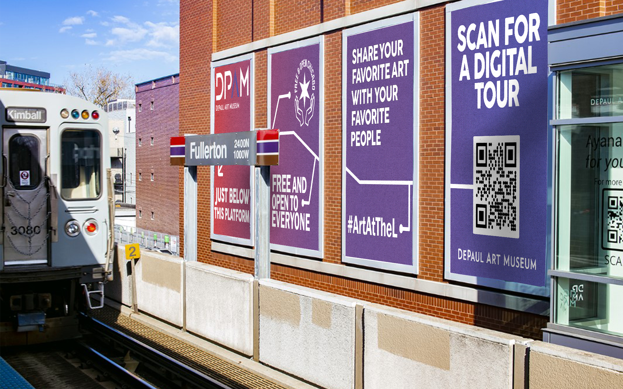
Primarily I functioned as a Visual Designer. I designed the Posters for the CTA facing advertisements as well as completed many mockups of various ideas and concepts to keep our clients in tune with our direction and intentions.
Project Manager/Lead
UX Designer
UX Researcher
Copywriter
Visual Designer
My Roles In the Group are highlighted in Blue
Users and Audience
We conducted interviews with individuals from diverse backgrounds, ages, and professions to gather their insights on the aspects of a museum visit that hold the greatest significance for them. Museums offer a multitude of perspectives and interpretations, and by understanding the preferences and dislikes of visitors, we can set off on the right path towards enhancing their experiences.
Our Stakeholders
DePaul students
DPAM’s location is in the heart of the DePaul Lincoln Park campus where students are constantly around. By considering the interests and preferences of DePaul students, our concepts provide an opportunity for them to engage with the museum's collection and activities.
Lincoln Park residents
As the DePaul Art Museum is situated within the Lincoln Park neighborhood, it is important to consider the preferences and interests of local residents. By catering to their needs, it can strengthen the museum's ties with the community.
CTA Riders
Given the museum's convenient access to public transportation, there are many commuters using the red line in the area. By taking their preferences into account, the museums can attract a broader audience and make attendance more convenient.
Scope
The scope of our project was relatively broad, focusing on the entire exterior required us to narrow down to a few specific aspects of the exterior.
We decided to focus on:
Side of the building that faces CTA platform
Sidewalk area in front of the museum building
Alley to the right of museum building
Front windows of museum building
Planter box in front of museum
Front door of museum
Constraints
We also faced some constraints with this project. One of the main limiting factors was the budget. We were tasked with creating partially physical interactive user experiences with little to no budget if possible.
At about the 10 week mark we got work that the very slight budget we were working with was reduced more due to the state of the economy. We had to adapt to these constraints.
Our Process
Our first experiment was prototyped footsteps that would be placed or drawn in chalk in front of DPAM leading up to the front door. We created chalk and vinyl footsteps leading up to the door in order to attract more people to the museum while leaving the CTA.
Durability: The footsteps worked well but the chalk version would not last more than a day or two in the elements. Our solution to this problem was switching the chalk to stick on vinyl that could be placed down easily, and cut for free in the IRL lab.
Effectiveness: We want to understand what kind of foot traffic and attention the building gets without our footstep variation. In order to do this we will be holding control tests by observing the DPAM on a day with similar weather and a similar time of day
Creating the DPAM Poster Set
When conceptualizing the design for the CTA posters, I conscientiously considered several fundamental aspects to ensure their long-lasting impact, regardless of the specific exhibit or time of year.
I paid particular attention to avoiding any time-sensitive or season-specific information in the posters. This approach allows them to remain effective and applicable regardless of when they are displayed.
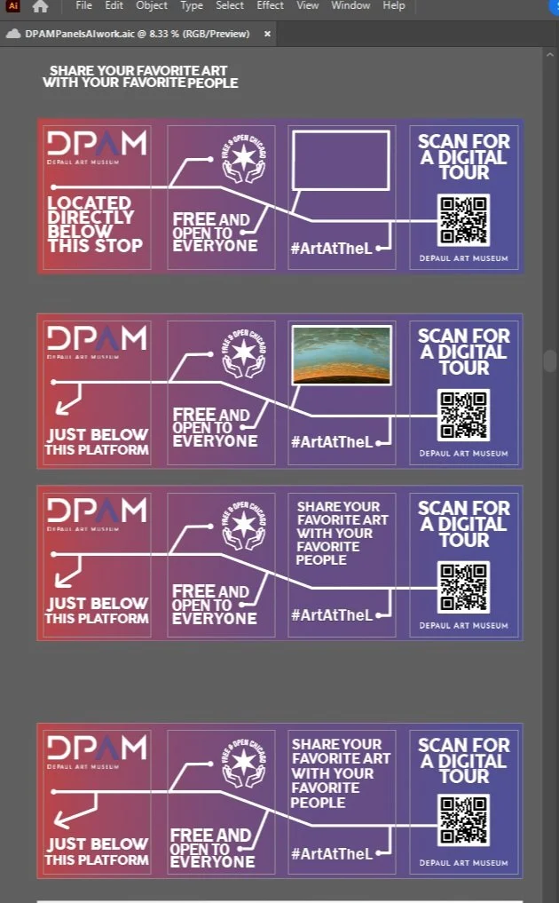
In the poster, I incorporated key elements such as the museum's location, the #ArtAtTheL tag, the DPAM logo, and a QR code leading to additional information about the museum.
To create a visually engaging design, I explored various layouts inspired by the classic CTA or Train Stop map. One concept involved a line connecting all four posters, with each "stop" conveying specific information. Importantly, the information presented on the posters is intended to remain relevant regardless of the passage of time.
The final design variations included a white background with gradient accents and a gradient background with white text. Both versions maintained consistent information while offering distinct visual aesthetics.
Testing
We conducted testing for many of our prototypes that seemed feasible. This included observing physical prototypes in action and surveying users on designs and concepts for the advertising posters.
Using some tape as well as printouts from the current exhibit, we created an optical illusion inside of the front vestibule of the museum. This style of illusion was inspired by an image we found on Pinterest and thought was eye-catching and simple to recreate.


